Last Friday the Wall Street gamblers made another run at “bad news is good news”, taking the averages up modestly after a frenetic chase around the barn and back. But at the end of the day, it’s high time to forget about the games played by Wall Street day-traders and recognize that bad economic news is just that—bad news.
The apparent negative in the October jobs report was the slight increase in the unemployment rate to 3.7% from 3.5% in September. That was supposed to mean that the economy was cooling and that the Fed could ease up on its tightening campaign.
But, as we have often said, the U-3 unemployment rate isn’t worth the paper it is printed on. However, that doesn’t gainsay in the slightest the actual bad news in the October’s jobs report, which bad news was spread far and wide across the report’s internals. The whole report, in fact, was just more evidence that the labor market is weak, not strong, and that the U.S. economy has slipped into a stagnant stupor.
For one thing, the U-3 unemployment rate, which is calculated from the household survey, posted higher owing to a 306,000 increase in the number of unemployed, while the number of employed workers actually dropped by 328,000.
That’s right. The Schrodinger’s Cat at the BLS said that jobs were +261,000 per the establishment survey, while the household survey posted the aforementioned -328,000.
To be sure, if this were just a one-month aberration, it would be reasonable to let it pass. But actually, since way back in March, the two surveys have been going in the opposite direction: The establishment survey, which feeds directly into the algos, is up by 2.45 million jobs.
At the same time, the household survey count has risen by just 150,000 jobs. That’s 94% less!
Moreover, if you scroll back further to the pre-COVID peak in February 2020, the disconnect is even more egregious. To wit, the 158.61 million household survey employment number posted in October was actually 258,000 lower than it had been before the Lockdowns, while the establishment survey figure was 804,000 higher.
Of course, neither number is anything to write home about, but the discrepancy does not involve any great mystery. What is happening is people are taking multiple jobs in order to stay abreast of the soaring cost-of-living, and also because work-from-home has made it very easy for free lancers and gig workers—especially in the tech sector—to attach themselves to two, three or even four employer payrolls. These all count as “jobs” in the establishment survey, but not in the household survey.
Needless to say, a second or third job which encompasses 5 hours of virtual work per week scamming some inattentive employer’s HR department is not the same thing as a traditional jobs at 40 hours of real work on the job site. The former is just one more example of the noise in the data that leads to a chronic over-assessment of the actual U.S. labor market.
Employment Level: Household Survey (purple line) Versus Establishment Survey (brown line), February 2020 to October 2022

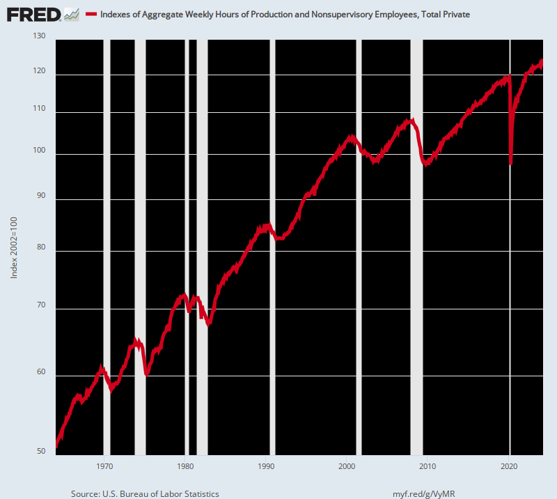
In any event, that’s why we find the aggregate hours index published by the BLS to be the most useful among its many bad takes on the labor market. It at least does not confuse a part-time gig with full time employment nor count the fourth job held by a (former) schemer at Twitter as evidence of a “strong” labor market.
On that basis, here is what we actually got after the post-March 2020 stimmy-paloozas during which the public debt increased by $4.5 trillion and the Fed’s balance sheet soared from $4 trillion to $9 trillion. To wit, total labor hours employed in the private sector increased barely a smidgen during that 32 month period. To be precise, the gain in employed hours amounted to just 0.4% per annum.
Index of Aggregate Weekly Hours for the Private Sector, January 2020 to October 2022

Stated differently, the October jobs report made it very clear that the purportedly “strong” labor market is stalling out, and has been for years. The index number for October, in fact, represented an anemic gain of 0.78% per annum since the pre-crisis peak in December 2007. That compares, for instance, to a 2.00% per annum growth rate of labor hours employed between 1964 and 2000.
So, were the financial press to report the data honestly, it would use the aggregate hours index to measure actual labor inputs to the economy, not the phony headline jobs count. In that event, of course, we would not get the kind of economist gumming that happened on Friday, alleging yet another “strong” jobs report:
Obama economist Betsey Stevenson: Strong jobs report….lots of hiring, broad based, and wage growth is slowing slight. The Fed just might get us that soft landing
Justin Wolfers, Keynesian academic: Non-farm payrolls grew by +261k in October, yet another month of stellar job growth. Past two months show revisions of +52k for September and -23k for August, so this is an even stronger report. Unemployment rate rose a tick to 3.7%. This is a very strong economy.
Really? True employment growth (i.e. total hours employed) during the last 15 years has grown at just two-fifths of its historic average, but these cats keep expectorating the “strong” word.
Index of Aggregate Hours, 1964-2022
Moreover, when it comes to high pay, high productivity jobs in the goods-producing sector (manufacturing, energy, mining and utilities) the data is even more unequivocal. The index of aggregate hours workers in the goods-producing sector is still nearly 0.6% below its pre-COVID peak in January 2019.
Needless to say, this is a big deal because the good-producing sector employs 21.3 million at an average annual wage of $68,300. In aggregate terms, the sector’s annual payroll amounts to $1.46 trillion.
As we have frequently noted, therefore, what we have is a 30-month cycle of born again jobs. After the deep plunge of April 2020 ordered by the Virus Patrol, labor hours employed in the goods-producing sector still haven’t gotten back to square one .
Moreover, when it comes to the longer-term trend, the picture is just plain disastrous. Compared to the turn of the century level in January 2000, total hours worked in the good-producing sector were down 16.3% as of October 2022.
How anyone in their right mind would characterize the chart below as a “strong” labor market is beyond us. What it really signifies is that the Washington public health nomenklatura crushed the supply-side of the U.S. economy, leaving the private sector to struggle to regain the status quo ante, which itself had been heading south for more than two decades.
Index of Aggregate Hours Worked In the Goods-Producing Sector, January 2000 to October 2022

Nor is the goods-producing sector an aberration. On the other end of the pay spectrum, the index of hours worked in the low-pay Leisure & Hospitality sector in October posted 7.8% below its February 2020 level. That’s about $40 billion of annualized payroll still gone missing.
That’s right. The Lockdown calamity in the spring of 2020 was so severe that hours worked in the sector plunged by 56%!
Since then the sector has been digging out of a hole so deep that there is no precedent anywhere in the historic jobs data. Yet after all of these born-again hours have been recovered, the index is still nearly one-eighth below its pre-Lockdown level.
Stated differently, the chart below has nothing to do with a “strong” labor market, even though the Wall Street gummers have been ballyhooing every one of the jobs regained since April 2020. What it actually shows is the mayhem generated by the Virus Patrol, followed by a desperate struggle by the private sector to regain its footing.
Index of Aggregate Hours Worked in the Leisure & Hospitality Sector, February 2020 to October 2022

As it happens, the story is the same in the high pay construction sector. Total hours worked in October were only a smidgen (+0.26%) above the February 2020 pre-COVID peak. More importantly, the October index was still 3.0% below the level reached way back in December 2006, meaning that this sector of the labor market has been experiencing negative momentum for a good while, as well.
Needless to say, there is simply no way to describe the graph below as evidence of a “strong” labor market when there were far fewer construction hours worked in October than 16 years ago.
What happened here, like in so many other sectors of the labor market, is that the Virus Patrol caused a devastating 20% plunge in hours worked during April 2020. The born again jobs and hours reported every month since then constitute nothing more than a giant unearthing operation by the private sector.
Index of Aggregate Hours In The Construction Sector, January 2020 to October 2022

Another high paying sector where hours worked has long been heading south is the utility sector. Total hours worked in October was still down nearly 2% from the pre-COVID level of February 2020.
More importantly, that was the tail end of a downward march that has been underway for three decades. Accordingly, the putatively “strong” labor market of October 2022 deployed 24% fewer hours than had been the case in early 1990.
Index of Aggregate Hours For the Utility Sector, 1990 to 2022

In the retail sector, hours worked peaked 53 months ago in May 2018. Notwithstanding the rebound from the 17% plunge in April 2020, the October hours index for retail was still 1% below its four-years ago peak.
Again, there is no reason to treat born again jobs and hours as labor market “growth”. And most certainly, when employment has actually plateaued on a trend basis for the past 22 years, the idea that the October report betrayed strength is just plain tommyrot.
Yet the numbers do not lie. In January 2001, the index of aggregate hours worked in the retail sector posted at 102.0 compared to 103.4 in October 2022. The math of it, therefore, is a per annum growth rate of 0.06%, if you want to credit rounding errors.
Index of Aggregate Hours Worked in the Retail Sector, January 2001 to October 2022

Another flat-lining sector is financial services and real estate. During October, the index of aggregate hours was actually below its level of last April and was still 1% lower than where it posted in February 2020.
Nor should the significance of this stagnation be gainsaid. After all, there has been a literal boom in financial markets and real estate during the past two-and-one-half years, yet employment has flat-lined.
So no “strong” labor market here, either.
Index Of Aggregate Hours in the Finance and Real Estate Sector, January 2020- October 2022

Even the formerly booming education and health sector has come a cropper. The index of aggregate hours worked in October 2022 represented a microscopic per annum growth rate of just 0.15% compared to February 2020.
As is evident from the chart, we are dealing here with born-again hours, as well. The index plunged by 13.3% during April 2020 upon the command of the Virus Patrol. Accordingly, 97% of the hours gain since then was accounted for by the recovery of hours lost to the Lockdowns, not organic growth from the February 2020 high water mark.
For point of reference, the growth rate for the 56 years ending in February 2020 was 3.3% per annum—-a level 22X higher for more than half a century. So even in the case of a sector mightily propped up by government transfer payments and tax preferences, employment growth measured by hours worked has slowed to barely a crawl.
Index of Aggregate Hours For Education and Health Services, February 2020 to October 2022

Indeed, if you examine the data for all of the dozen or so separate industries for which the BLS provides an aggregate hours index, only two displayed a meaningful gain during October 2022 compared to the pre-COVID level of February 2020. The aggregate hours index for the warehouse and transportation sector is up by 11.7%, while the index for professional and business services was 6.4% higher than its pre-COVID level of February 2020.
But in both cases we see a skunk slithering along the woodpile. The well documented super-surge in Amazon-delivered merchandise goods was an unsustainable artifact of the Lockdowns and massive stimmies. That is now over, of course, but while it lasted there was a massive hiring boom in the warehouse and transportation sectors—-a boom that inexorably has led to substantial excess capacity. Accordingly, when the layoffs start, the blue line below is likely to be heading south. Big time.
Likewise, work-from-home has been heavily concentrated in the professional and business sector. But recent large scale layoffs in the tech sector, epitomized by last week’s 50% slash of the Twitter work force and the impending jobs massacre at Facebook, herald a day of reckoning for the hiding-at-home triple pay-check collectors.
Indeed, the over-hiring in this sector, which accounts for 22.5 million of the highest paying jobs in America, likely occurred on a monumental scale. And it means that the brown line below will also be heading sharply south in the months ahead.
Index of Aggregate Hours for Transportation and Warehousing And Professional and Businesses Services, February 2020 to October 2022

In short, the labor market is far from strong, and actually reflected virtually zero hours growth on an overall basis since the pre-COVID peak in February 2020, aside from the two soon to be reversed anomalies reflected above. So the derivative notion that the U.S. economy is also strong is just plain poppycock.
Ironically, the systematic structural weakening of the U.S. labor market displayed above occurred in the context of a massive money printing spree by the world’s central banks, which is embodied in the staggering growth of their collective balance sheets. Compared to $4 trillion in 2002, the combined balance sheets of the world’s central banks now total in excess of $43 trillion.
There is nothing like this in recorded history, but its differential impact on the world economy is the lynch pin of what comes next. That is to say, in high labor cost areas like the U.S. the last decade’s money-printing bacchanalia led to a massive off-shoring of industrial production to low-cost venues led by China. In turn, that fostered the concomitant experience of what appeared to be “lowflation” owing to the resulting huge inflows of cheap foreign goods.
At the same time, the reciprocal monetary expansion in China, Vietnam, Mexico and other lower cost economies generated a debt-fueled malinvestment spree of biblical proportions. The result was a vastly bloated production capacity to service U.S., European and other developed world consumers. That is to say, the developed world got what appeared to be period of low-growth/lowflation prosperity, while the previously less developed world experienced a debt-fueled rise of investment and manufacturing production at breakneck speed.
Indeed, to call the impact on the U.S. economy “split-screen inflation” hardly does justice to the word. During the 25 years after China became an export powerhouse in the mid-1990s, the U.S. PCE deflator for durable goods plunged by a staggering –40%, while the PCE deflator for Services soared by +87%.
Yet in terms of the Fed’s mindless focus on its annual inflation “goal”, all was held to be well. Never mind that the Fed hit its sacred 2.00% target only because of a one-time and unsustainable collapse in durable goods inflation, which caused its preferred yardstick (PCE deflator) to round-out slightly below (1.80%) its target.
Per Annum Index Change: 1995-2019
- Durable Goods Deflator: -2.00%;
- PCE Services Deflator: +2.56%;
- Overall PCE Deflator: +1.80%
Split Screen Inflation: Overall PCE Deflator Versus Durables Goods Deflator And Services Deflator, 1995-2019

The fly in the ointment, of course, was a massive parallel inflation of financial assets everywhere—from New York to London, Mumbai and Shanghai. But so long as central bank credit kept expanding, the giant global financial bubble, and the $260 trillion of debt on which it precariously rests, managed to stay afloat.
No more. The Fed and other central banks will now be required to relentlessly attack the global financial bubble they created in order to suppress the virulent goods and services inflation that has been simmering below the surface all along.
As it turned out, the massive, deflationary global supply chain was always too brittle and too artificial to be sustained, especially in the face of exogenous disruptions. Those came after 2019 in the form of the COVID Lockdowns, massive worldwide government spending stimulus and then Washington’s Sanctions War on the world’s commodity markets and payments and trading system.
Among other things, this caused the split-screen inflation era to disappear overnight. Since December 2019, there has been no counterweight to domestic services inflation from the goods sector. Both durable and nondurable goods deflators have risen at rates not seen since the early 1980s, causing the overall PCE deflator increase to more than double.
In fact, the services deflator (brown line) increase of 3.73% per annum since Q4 2019 is now the laggard, with durable goods (blue line) and nondurable goods (yellow line) pulling the overall PCE deflator index (black line) sharply higher.
Per Annum Index Change Since Q4 2019:
- PCE Services Deflator: 3.73%;
- PCE Deflator for Durable Goods: 4.58%;
- PCE Deflator for Nondurable Goods: 5.21%;
- Overall PCE Deflator: 4.20%
PCE Deflator And Components, Q4 2019 To Q3 2022

Needless to say, the Fed is now caught up high and dry. The artificial “lowflation” from the goods sector is now over and done. If anything, the further unraveling of global supply chains will cause a reversal of the 1995-2019 lowflation windfall, as goods production is returned to higher cost domestic venues. And if the neocons continue to get their way in Washington, the proxy war on Russia will escalate, causing a new round of destructive ructions in the commodities markets.
It will also mean that the vaunted Fed “pivot” to rescue the collapsing financial bubbles simply will not happen. The momentum of goods, services and labor inflation is simply too strong for the Eccles Building to reverse course. Moreover, the Fed’s absolutist paint-by-the numbers determination to get back to its sacred 2.00% inflation target will only prolong the Great Financial Deflation now coming down the pike.
What the sell-side economists don’t get is that the Keynesian Phillips Curve trade-off between employment and inflation was never valid in the first place; and that the recent massive disruption of economic activity owing to the Lockdowns and stimmies means that current government data points do not remotely resemble business cycle trends of the past.
With respect to the latter, the labor force participation rate tended to peak as the business cycle reached so-called full employment, reflecting that fact that available incremental labor hours were pulled into gainful employment. This is evident in the chart below for the 1990, 2001, 2008-09 and 2020 pre-recession periods, and is a case of supply-side magic at work.
That is, drawing additional labor resources into the monetized economy is not inherently inflationary. The inflation ultimately comes from bad money, not too many people working.
By the same token, the loss of labor resources from the monetized economy is not inherently deflationary, either, if foregone labor income is replaced with transfer payments and the draw-down of existing savings.
And that is where we are now. We have had a massive outpouring of fiscal and monetary stimulus, but the labor force participation rate is still at a deep, modern low. That’s because the artificial spending “demand” generated by Washington was counter-acted by fiscal subsidies for non-production and state-supported idleness. There was no stimulus multiplier!
In this context, it should be noted that we begin the chart below in 1990 for a good reason. The 40-years before that are not comparable due to the one-time build-up of the ratio during 1950-1990 as women massively entered the monetized (as opposed to household) labor force.
In any event, you do not have a “strong” labor market when there has been a secular trend toward a reduced labor force participation rate since the year 2000. In effect, the sum total of Washington policy—-lockdowns, COVID fear-mongering and unprecedented stimmies—was anti-supply side.
Labor Force Participation Rates At Cyclical Peaks:
- January 1990: 66.8%;
- February 2000: 67.3%;
- December 2006: 66.4%;
- February 2020: 63.4%;
- September 2022: 62.3%.
Labor Force Participation Rates, 1990-2022

The collapse of the labor force participation rate since the year 2000 is no trifling matter. It reflects the equivalent of 13.2 million workers who have left the labor force due to retirement, disability, Medicaid, food stamps, other forms of Welfare State support or, in the case of some millennials, a cushy life in mom-and-dad’s basement.
Either way, the supply side represented by the labor market has contracted sharply, even as government-fueled demand has been bloated beyond all prior precedent. What that spells, of course, is labor cost-driven Stagflation.
And for want of doubt that a wage-price spiral is now built-in, here is the hourly wage gains on a Y/Y basis from the major labor market sectors as posted in the October jobs report.
Y/Y Change in Average Hourly Wage Rate:
- Warehouse & Transportation: +8.5%;
- Leisure & Hospitality: +7.1%;
- Construction: +6.6%;
- Utilities: +6.4%;
- Financial Services: +6.0%;
- Goods-producing: +5.7%;
- Wholesale: +5.4%;
- Health & Education: +5.3%;
- Business & Professional Services: +5.1%;
- Total Private Employment: + 5.5%.
In Part 3 we will track the manner in which rising wages and the pressure for “catch-up” increases from already experienced cost-of-living rises will likely keep the inflationary momentum going for many quarters to come. In effect, the idled labor which is supposed to be generated by Fed tightening has already been taken out of the labor force by the Virus Patrol and the artificial build-up of “savings” from the two years of government fostered stay-at-homes and stimmies.
In the meanwhile, it needs be emphasized that on a going-forward basis the inflationary spiral will not depend upon services inflation alone. That’s because the so-called food and energy complex is not cooling nearly as rapidly as Wall Street pundits would have you believe.
As it happens, the utility portions of energy costs—represented by electricity and piped gas—have not cooled down at all. Household electricity bills are already up 15.5% from prior year, while the CPI for piped gas used for home heating and cooking is 33% higher than last year. Moreover, neither line in the chart has been bending sharply lower in recent months.
Y/Y Change In Household Electric and Piped Gas Bills, 2017 to 2022

Likewise, both portions of the food index are still rising at an aggressive clip: Compared to one year ago, food away form home (e.g. restaurants) was up by 8.5% in September, while grocery store prices were higher by 13.0%. And both lines reflect a vertical ascent that evinces no sign of slowing in the months just ahead.
As it happens, these food accounts on a combined basis represent 13.65% of the weight in the CPI, and were up 11.29% on a weighted average basis during the past year. That’s the highest annual increase in 43-years (May 1979)!
Y/Y Change In CPI Components For Food Away From Home And Grocery Stores, 2017-2022

The only part of the food and energy complex that has actually been cooling is the petroleum based transportation and heating fuels, which account for just 4.57% of the weight in the CPI. While the Y/Y rate of change (blue line) was still 19.7% in September, the monthly rate of change (brown line) had been negative for three months running, bringing the Y/Y trend sharply lower, albeit from the out-of-this-world 61% Y/Y gain posted in June.
Moreover, since mid-September the national average gasoline price has stabilized at about $3.80 per gallon, while diesel and jet fuel prices have continued to soar. Retail diesel prices currently at $5.33 per gallon are up 6% from mid-September levels (when the last CPI was taken) and 49% from year ago prices.
So while it is evident that petroleum based fuel prices are coming off the late spring boil, the 19.7% Y/Y gain shown below is not exactly disinflationary. That will especially be the case in the months ahead if middle distillate prices continue to rise and gasoline prices rebound in response to the further reduction of Russian oil on the global market after the full European ban on seaborne imports takes effect in early December.
CPI For Energy Commodities: Y/Y Change (Blue Line) Versus Month-Over-Month Change (Red Line), May 2020 to September 2022

On an all-in basis, therefore, the food and energy complex is not the near-term deflationary force it is cracked up to be. On a Y/Y basis the combined food index components are up by 11.3% and the combined utility energy services components are up by 20.3%, and they continue to rise at a hefty clip on a monthly basis.
Together these components account for 17.31% of the weight in the CPI, compared to just 4.66% attributable to gasoline and middle distillates. That is, 79% of the weight in the food and energy complex (total weight=21.88%) is showing no sign of slowing down.
For instance, here is the sub-index for both components of food in the CPI. During the most recent month (September), the annualized monthly rate of increase (red line) was a hefty +9.4%, a level only slightly below the aforementioned Y/Y figure of +11.3%. This means as a purely statistical matter that the food index will be rising strongly well into 2023, even if the monthly rate of increase should cool abruptly in contrast to the recent irregularly rising trend (red line) in the chart below.
CPI Food Index: Y/Y Change (Black Line) Versus Monthly Change Annualized ( Red Line)

Needless to say, with plenty of inflationary pressure in the food and energy complex, the idea that the overall CPI will be fading rapidly in the months ahead is just a perma-bull pipe dream. After all, with domestic labor costs escalating at the 6%+ levels shown in Part 2, there is no way the CPI index for services is going to come off the boil anytime soon.
And it is on the boil compared to the last 40 years. The Y/Y gain of 7.4% in September was the largest increase since September 1982, and more than double the 3.2% Y/Y increase posted in September 2021. That is to say, the virtually vertical blue line in the chart below is indicative of strong forward momentum, not a turn lower just around the corner.
Y/Y Change In CPI For Services, 1982-2022

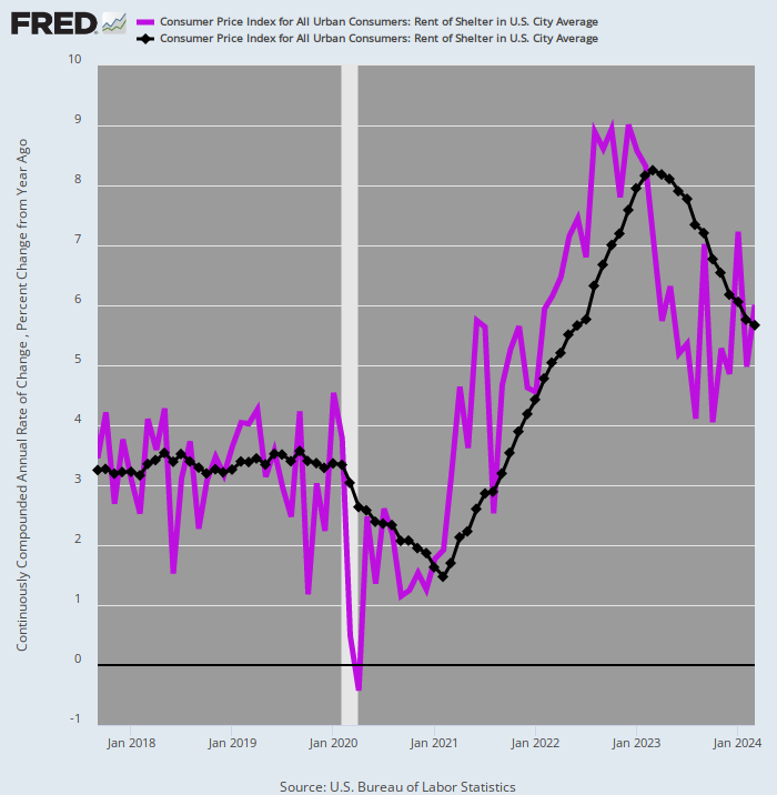
To be sure, slightly more than half of the weight in the CPI index for services (60.51%) is accounted for by rent of shelter (32.11%), and some buy-the-dippers insist that rents are about ready to implode. But that’s based on a faulty reading of the seasonal decline in month-over-month asking rents for new leases—a decline that occurs every year during the fall months.
Moreover, asking rents on new leases are not the correct measure of rent inflation faced by all U.S. households, anyway. Given that home rental contracts tend to be for a year or longer, its takes time for the trend in “asking rents” to roll-through the entire stock of rental housing, which is the reason the CPI shelter index reflects a persistent lag between its readings and those posted for asking rents by leading private real estate services.
Accordingly, the relevant measure of where the CPI rent of shelter numbers are heading lies in the comparison between annualized monthly rent changes (purple line) and the Y/Y change (brown line). As shown below, the former have been exceeding the latter since January 2022, meaning that as a matter of arithmetic, the Y/Y trend will be heading higher for many months to come.
In fact, during September, the annualized rate of monthly change was 9.15%, a figure nearly 40% higher than the Y/Y gain of 6.7%. In short, even if falling prices for new housing in the period ahead cause asking rents to cool-down materially, it will be well into 2024 before the rent of shelter index can find its way back toward the Fed’s 2.00% target.
CPI Rent of Shelter Index: Annualized Monthly Change (Purple Line) Versus Y/Y Change (Black Line), 2017-2022
In any event, the CPI services index excluding rent of shelter actually rose by 8.1% in September, a figure even higher than the 7.4% gain for the total services index. That means, of course, that the 28.40% of the CPI weight accounted for by services less shelter services is rising even faster than rental rates.
Moreover, as the contrasting red and black lines in the chart below imply, there is no indication that this sub-index is about to rollover anytime soon. While the annualized monthly rate of gain (red line) has been volatile, it has been well above the Y/Y trend during seven out of the last eight months, thereby implying that the Y/Y index will have considerable upward momentum during the months ahead.
CPI Index For Services Less Shelter: Annualized Monthly Change (Red Line) Versus Y/Y Change (Black Line), 2017-2022

In the context of rising labor costs and the resultant inflationary pressures from the services sector a further adverse trend in the macro-economic data needs be noted. Namely, that the 5-8% gains in wage costs among the various domestic sectors are not being off-set by any productivity gains at all.
This is wholly abnormal, and a further measure of the adverse impact of the Lockdowns, stimmies and the resulting labor force defections of the working age population. To wit, since Q1 2021, total labor costs gains (including benefits) have risen from a 3.0% annualized rate (black line) to 5.1%, while productivity gains (purple line) have gone in the opposite direction, plummeting from +2.2% in Q1 2021 to -1.4% in Q3 2022.
Needless to say, that gap adds to unit labor costs growth (brown line). Accordingly, during the past three quarters unit labor costs have risen by in excess of 6.0% per annum, representing the highest sustained gains in more than four decades.
Annualized Change in Total Compensation Costs, Labor Productivity And Unit Labor Costs, Q1 2021 to Q3 2022

At the end of the day, the macro-condition of the U.S. economy amounts to one hellacious case of stagflation. The labor market and economy are weak. The embedded inflation is exceedingly strong.
What that means, in turn, is that the Fed’s alleged aggressive interest rate increases are actually a day late and a dollar short. To even begin to dent the inflationary momentum, it will have to drive the benchmark UST rate way above the 5.0% level now implicit in the Fed funds rate.
Yet it is the prospect of dramatically higher UST yields that will ultimately cause the financial furniture to break big time—especially among duration sensitive stock prices. To wit, on the margin the U.S. has been pawning off its massive $31 trillion public debt to foreign investors.
The Japanese alone, for instance, have accumulated about $1.2 trillion of U.S. government debt, mainly because it yielded well more than the pitiful 0.25% decreed by the Bank of Japan. These UST yields, in turn, provided a more attractive return than available on the home market even after accounting for the cost of currency hedging.
But the hedged dollar trade doesn’t work anymore, owing to the collapse of the yen. The latter has caused currency hedging cost to rise dramatically.
So both the Japanese institutions and Mr. and Mrs. Watanabe have had their fill of losses on dollar bonds, meaning that the world’s biggest buyers of U.S. Treasurys for years, who mightily helped hold down borrowing costs for American businesses and consumers, are now vacating the dollar bond pits.
As The Wall Street Journal recently noted,
Signs are mounting that Japan’s government is selling short-term U.S. bonds, part of an effort to prop up its currency. On Sept. 22, the yield on the 10-year U.S. Treasury note logged its second largest jump of the year after Japan’s government said that it was buying yen with dollars from its foreign currency reserves for the first time since the 1990s.
At the same time, some Japanese institutional investors are racing to reduce their foreign bond-holdings, including Treasurys.
The Federal Reserve’s interest-rate increases have weakened the yen and made it costlier for Japanese investors to hedge against currency fluctuations when buying U.S. assets. As a result, instead of counting on Japanese investors’ demand for Treasurys, investors have become increasingly concerned about a potentially destabilizing shift in global capital flows.
The decline in Japanese demand comes as the U.S. bond market is suffering one of its worst years in history, having been battered by persistent inflation and escalating expectations for how high the Fed will need to raise rates. As bond prices have fallen, Treasury yields have climbed to their highest level in more than a decade.
Indeed, for years many Japanese speculators engaged in an even more frisky form of hedged arbitrage. That is, they scooped up longer-term U.S. bonds not just because they offered higher yields than Japanese bonds but because yields on longer-term Treasurys were higher than those on shorter-term Treasurys. This allowed them to earn good returns by borrowing dollars at short-term rates and then buying longer-term bonds—a move that also acted as a de facto hedge against currency fluctuations!
That game is quickly coming to an end, however. Just in the last four months, Japanese life insurers and pensions alone reduced their foreign bond-holdings by nearly $40 billion, according to Japanese government data. That comes after they added roughly $500 billion since the start of 2016, when BOJ policies drove Japanese bond yields below zero.
In short, central bankers have mangled the world’s capital markets nearly beyond repair. As the Fed now attempts to undo the inflationary impact of its reckless money-printing over several decades, the coiled spring of consequent leveraged speculation and malinvestment the world over is destined to destructively unwind.
So what we have is not just the worst stagflation in 40 years, but also a constellation of central bank induced investment errors that will materially compound and prolong the tight money cure now just getting underway.
This article was originally featured at David Stockman’s Contra Corner and is republished with permission.