The long-feared second wave of COVID-19 in the United States appears to have arrived. National case numbers are making new records and two states have started to move back towards quarantine.
Since news reports on the virus continue to emphasize the wrong metrics, some important facts about the new wave often get missed. Here are three things to know about the new rise in cases.
1. The recent rise in cases cannot be explained by increases in testing.
This is an important point because the onset of a second jump in cases has been declared prematurely several times before now. These types of reports came in different flavors. Sometimes, they calculated percentage growth rates off extremely small numbers (at a county level for instance) to report an eye-popping rate of growth. More commonly, they failed to highlight the fact that total testing was increasing faster than new cases–suggesting the virus was probably just as common as it had been days earlier, but the state was able to confirm more cases.
This time is different. Many states are experiencing both a rise in absolute cases, and a rise in the percentage of cases that is coming back positive (the positivity rate). This is a clear sign that things in these places is getting worse with respect to the coronavirus.
As of June 27, these are all the states that was seeing both a positivity rate above 10% and weekly rise in that rate. The original data for the table below comes from The COVID Tracking Project:
So, while not all of these states are in crisis right now, it is correct to say we are seeing a pronounced jump in cases in many places. It’s not just a figment of the data / reporting like it had been before.
2. The rise in cases is primarily occurring in places that were not hit hard before.
When you look at a chart of the national numbers of new cases, you can clearly see the second wave that’s occurring. Using the data through June 27, our weekly figures of new cases is rapidly approaching the previous peaks set in April.
The trend below shows rolling 7-day positive cases for the US (all states plus DC and Puerto Rico) per 100,000 people:
On a national basis, the second wave description looks appropriate. But this obscures very different trends at the state level. In reality, the places where cases are rising did not experience much of a peak earlier on the crisis.
Consider the trends below for four states that have been making headlines in the past few days: Texas, Florida, California, and Arizona.
In this data, we see that Texas experienced a slight uptick in April, but it was much smaller than what we’re seeing now. For Arizona, Florida, and California, the recent rise they are experiencing is their first serious increase when adjusted for population. Conversely, states like New York and New Jersey saw their large increase in March and April, but are now seeing stable or declining cases.
This pattern demonstrates one of the many problems with demanding a nationwide lockdown in a country as large as the US. In effect, all states shut down (to varying degrees) based on the experience of New York, New Jersey, and a couple other hotspots. They did this without regard to whether the outbreaks they were experiencing could possibly warrant such dramatic action.
Now that some of these same states are facing a real outbreak close to home, they’re starting to do a new round of limited restrictions. In the face of an economy on life support, widespread social unrest, and an election year, it’s unclear much people will tolerate or comply with another aggressive attempt at quarantine.
3. So far, the second wave appears to be less lethal than the first wave.
Another important characteristic of the second wave is that, at least so far, it looks like to be less deadly than the earlier spikes.
Some commentators have made this point by looking at the trends in death counts for the new hotspots. However, this is not a good way to evaluate the lethality of the second wave at this point.
Deaths are a lagging indicator in this data. According to facts summarized by Our World in Data, death typically occurs between 2 weeks to 8 weeks after the onset of symptoms, which in turn show up several days after initial infection. Many of the cases being discovered now will eventually prove fatal, but they won’t be counted for several weeks. Looking at death rates today in the new hotspots risks providing a false sense of reassurance.
A better way to evaluate the likely lethality of this second wave in real time is to look at the trends in hospitalized COVID-19 cases.
We saw previously that the rise in new cases is now above the levels seen in April. Fortunately, for now the hospitalization data is not following the same trajectory.
In the chart below, we see the national trend in per capita positive cases combined with per capita hospitalization:
Here, we see that national hospitalization data has stabilized but has started to move upward, but is not accelerated at the same pace as total cases.
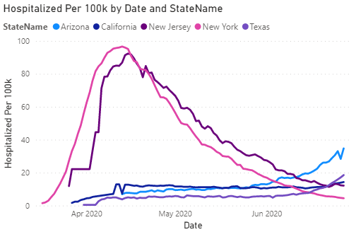
When we look on a state-by-state basis, a similar pattern emerges. Below, we present the hospitalization trends for current and prior hotspot states. (Florida is omitted due to a lack of reliable hospitalization data.):
Of the new epicenters, Arizona again shows up as an outlier on hospitalization. But even so, it’s still a ways out from the extreme per capita hospitalization levels seen earlier in the northeast. Meanwhile, the other states are on a slight upswing, but still low in terms of overall numbers.
There are several different reasons that might help account for the lower hospitalization rates in this cycle.
One explanation is that the average age of COVID-19 individuals is lower than it was in the first wave of cases. CNN recently reported on this rise in infections among young people as a cause for alarm…
“It’s a little bit of a disturbing trend, and what frightens me is not only that they are younger, the potential of them infecting other people, particularly parents and grandparents,” Dr. Robert Jansen, chief medical officer at Grady Health System, told WSB.
…but in fact, it’s much better than the alternative. If more people are going to be infected, it’s obviously preferable that the people with the lowest chance of serious illness are the ones that get it.
It’s worth remembering that one of the reasons that New York and New Jersey fared worse than other states is that they had a policy which inadvertently increased the probability that older, more vulnerable people would be infected. In an attempt to preserve hospital capacity, these governments required hospitals to discharge COVID-19 patients back to nursing homes before it was confirmed that they no longer had the virus. The result was that the virus was effectively being reintroduced in nursing homes, spreading widely among a high-risk population.
Another reason for lower relative hospitalization rate in the new epicenters is that the testing is far more widespread. When New York was dealing with its peak in April, testing capacity was still being ramped up. This meant that the tests had to be reserved for healthcare workers and people with severe symptoms. In turn, we know that the total confirmed cases in April for New York and other states significantly understated the true number of cases. We just don’t know how large the understatement was.
Since the virus is hitting states like Arizona later, the testing limitations are not as severe. In all probability, this means that the confirmed case count in Arizona today is closer to the true number of infections.
This is not to suggest hospitals will have the capacity they need. When new cases are concentrated in specific parts of a state (as is occurring in Houston, Texas), hospitals will again be strained beyond their normal limits.
The point is that, at least for now, the trend is not nearly as dire as what the northeastern states saw previously. That nuance is easily lost among a sea of news headlines about record new cases.


